
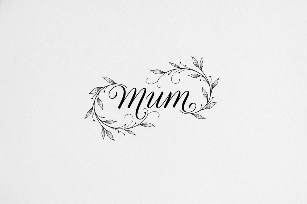
Mum Lettering Tattoo Designs And Ideas
Key Takeaways
- Mum lettering tattoos usually come down to the single word “Mum”, her first name, a short phrase she said, a date, or a line of her own handwriting turned into ink.
- Thin script with tight loops and fine serifs blurs and thickens as skin settles, so bolder, well-spaced letters hold their shape far longer.
- A word only she used, or a phrase she signed off cards with, carries more than the generic word “Mum”, because it belongs to her rather than to a category.
- Handwriting can be traced from a birthday card, a letter or a shopping list and tattooed exactly as she wrote it, and even faint or shaky writing from her last months can be used.
- Lettering suits ashes work because it uses solid, deliberate lines rather than fine shading, so the ink sits cleanly and the words stay sharp.
- Bubblegum Ink matches ashes to the right particle size, cleans, sterilises and decontaminates them, then blends them into a bespoke particle-matched ink, which heals exactly like ordinary tattoo ink.
- Clients can bring the whole container and let Paul Cutler take out what he needs, or measure around a teaspoon at home, with everything unused going back the same day.
- Flatter areas such as the inner forearm, upper arm, ribs and collarbone hold lettering cleanest, while fingers, feet and the side of the hand blur fastest.
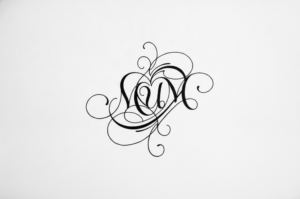
Lettering for a mum usually comes down to a few clear choices: the single word “Mum”, her actual name, a short phrase she said, a date, or a line of her own handwriting turned into ink. Simple, clean lettering ages best. Thin script with tight loops and fine serifs tends to blur and thicken as the skin settles over the years, so bolder, well-spaced letters keep their shape for far longer. If you’re carrying her ashes into the piece, the lettering can be inked with a bespoke, particle-matched tattoo ink that a small amount of her prepared ashes is blended into, so the words themselves are made from her.
That covers the short standard answer. The rest is worth thinking through properly, because lettering looks deceptively easy and the small decisions are what make it work or not.
What Are The Best Mum Lettering Tattoo Ideas To Start With?
Start with what you’d want to read for the rest of your life. A lot of people default to the word “Mum” and there’s nothing wrong with that, but push a little further first. Was there a name only you called her? A signing-off word she used on every card, like “love always” or “chin up”? Those beat the generic word every time because they’re hers, not a category.
Some ideas that tend to land well:
- The single word “Mum”, “Mam”, “Mummy” or “Ma” depending on what you called her
- Her first name, or the nickname she went by
- Her name with two dates underneath, kept small and neat
- A short line she said often, five or six words at most
- A single word that sums her up: “brave”, “always”, “home”
- Roman numerals for a date that mattered, her birthday or the day you lost her
Keep the wording tight. A long quote shrinks the letters and a long quote in fine script is the fastest way to a smudge in ten years. If you’ve got your heart set on a full sentence, break it across two or three lines and give it room.
Which Fonts And Styles Work Best For A Mum Tattoo?
The font does most of the emotional work, so it’s worth slowing down here. Broadly you’re choosing between four families.
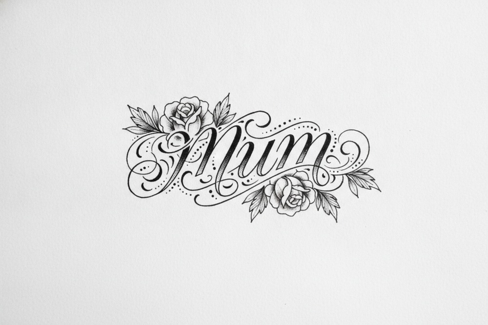
Script and cursive reads soft and personal and it suits a mum tribute. The catch is that very fine, flourishy script with hairline connectors doesn’t hold. Ask for a script with a bit of weight in the strokes and space between the letters. Roman and serif lettering looks classic and steady and it stays legible for decades. Sans-serif, plain block-style letters, feels modern and clean and it’s forgiving as it ages because there’s nothing fiddly to blur. Then there’s her own handwriting, which isn’t a font at all but a scan of something she wrote.
That last one is often the most moving. If you’ve kept a birthday card, a shopping list on the back of an envelope, a recipe card in her looping biro, that signature or phrase can be traced and tattooed exactly as she wrote it. There’s real detail to getting handwriting right and it’s worth reading up on mum handwriting ashes tattoo ideas before you commit, because the source you pick changes how well it translates. A shaky, faint signature from her last months can still work, but it needs a careful hand to keep the character without losing it to blur.
Whatever style you land on, size matters as much as the font. Letters that are too small close up as they heal. When in doubt, go a touch bigger than feels necessary.
How Do You Add Your Mum’s Ashes To Lettering?
This is where lettering becomes something more than a name. A small amount of your mum’s ashes can be prepared and blended into the ink, so the letters are literally made with part of her.
The ashes aren’t dropped in raw. They’re matched to the right particle size, cleaned, sterilised to clinical standards and cleared of contaminants first, then blended into a bespoke, particle-matched, high-quality tattoo ink. Once that ink is in the skin it heals and feels exactly like any ordinary tattoo, same sensation on the day, same healing after. There’s more on how that preparation works on the page about adding ashes into tattoo ink if you want the detail before you enquire.
Lettering is a good candidate for ashes because it uses solid, deliberate lines rather than fine shading, so the ink sits cleanly and the words stay sharp. A bold “Mum” or a name in steady serif carries the ashes beautifully and stays readable for the long run.
How Much Do You Have To Watch, And What Do You Bring?
A worry that comes up a lot: how much of this do I have to be part of? The honest answer is however much you want. You decide. Some people want to watch the whole thing, the measuring, the blending, all of it. Others find that too much and would rather sit back and let it happen. Both are completely fine. The ashes stay in view the whole time, never carried off to a back room and if you’d sooner look away for the blending part that’s done gently and there’s no pressure either way.
On what to bring, the simplest option is to bring the whole container along and let Paul take out what’s needed himself. That suits anyone who’d rather not handle the ashes directly and it means you don’t have to measure anything at home. If you’d prefer, you can measure out a small amount, roughly a teaspoon’s worth, before you come and just bring that. Either way only a little is used and the rest goes home with you the same day.
Because the studio is private and appointment-only, none of this happens on a busy shop floor with other people milling about. It’s a one to one appointment and that quiet matters when the piece means this much. Around twenty years of doing ashes work specifically means the measuring and blending are second nature here, so the emotional weight of the day isn’t competing with someone figuring out the technical side as they go.
Where Should Mum Lettering Sit On The Body?
Placement changes how a lettering piece reads and how long it lasts. Flatter, less stretchy areas hold letters cleanest, the inner forearm, the upper arm, the ribs, the collarbone. Fingers, feet and the side of the hand look great in photos but the ink there fades and blurs fastest, so think twice for anything you want to stay crisp.
Direction is worth planning too. Some people want the words facing themselves, running down the inner forearm so they can read it, a private message. Others place it to be read by the world. Wrist script, a name along the collarbone and a short line down the ribs are all popular for a mum. If you want to weigh up the options properly there’s a whole page on mum memorial tattoo placement ideas that goes area by area.
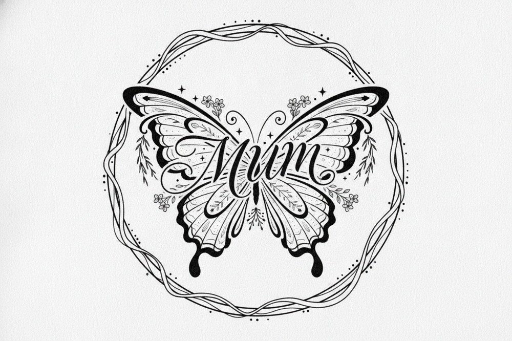
Lettering also pairs well with a small symbol, a single flower, a tiny heart, a date. Keep the balance in favour of the words though. The lettering is the message; the symbol is punctuation.
Can You Combine Mum Lettering With Other Elements Or A Dad Tribute?
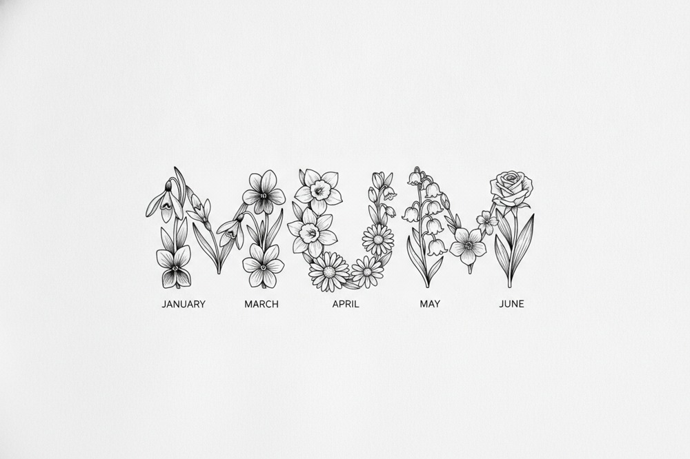
Plenty of people want more than just the word. A name threaded through her birth flower, a short phrase wrapped around a date, her signature above a small heart, all of these work as long as the lettering stays the focus and doesn’t get crowded.
If you lost both parents, a shared design often means more than two separate pieces. Her handwriting and his side by side, or both names in matching lettering, reads as a proper pair. There are some lovely approaches to that on the page about mum and dad memorial tattoo ideas, including how to balance two different handwriting styles so neither gets lost.
For the fuller picture on everything from design to the day itself, the mum ashes tattoos guide pulls the whole topic together and is a good place to sit and think before you decide on the wording.
FAQ
What’s The Best Single Word For A Mum Lettering Tattoo?
The best word is the one you called her or a word that was hers. “Mum”, “Mam” or “Ma” all work, but a name only you used, or a word she said constantly like “always” or “brave”, carries far more than the generic term. If nothing obvious jumps out, her first name in clean lettering rarely dates.
Can My Mum’s Handwriting Be Used For The Lettering?
Yes. A signature, a phrase or a whole note in her own writing can be traced and tattooed exactly as she wrote it, from a card, a letter or something as ordinary as a shopping list. Even faint or shaky writing from her later years can work; it just needs a careful hand to keep her character without letting the fine lines blur.
Will A Small Lettering Tattoo Blur Over Time?
Very small or very fine script is the type most likely to close up and blur as the skin heals and ages. You can avoid it by going a touch bigger than feels necessary, choosing a font with a bit of weight in the strokes and placing it on a flatter area like the forearm or collarbone rather than the fingers or feet.
How Much Of My Mum’s Ashes Is Needed For A Lettering Tattoo?
Only a small amount, roughly a teaspoon’s worth. You can bring the whole container and Paul will take out what’s needed, or measure that small amount at home beforehand. Lettering uses solid lines rather than heavy shading, so a little goes a long way and the rest goes home with you the same day.
Does An Ashes Lettering Tattoo Hurt More Than A Normal One?
No. Once the prepared ashes are blended into the bespoke ink it behaves like any ordinary tattoo ink in the skin, so the sensation on the day and the healing afterwards are the same as a standard lettering piece. Placement affects the feeling more than the ashes do; bonier spots like the ribs or collarbone tend to feel sharper than the forearm.
Should I Add Dates Or Symbols To The Lettering?
A date, small flower or tiny heart can sit beautifully with a name, as long as the words stay the main event. Keep any extras small so they act like punctuation rather than competing with the lettering. Roman numerals are a neat, understated way to work in a date that matters.
Written by Paul Cutler of Bubblegum Ink ®. His memorial work has featured on the BBC and in national and international press, including the tattoo made for a decorated military dog. He founded the studio in Sandbach and has tattooed for over 30 years and 20 + of them spent specialising in cremation ashes tattoos. Read more about Paul.